Flowers add a touch of romance, color, or beauty to any room, along with a variety of fragrances. However, like fashion and home décor, flowers tend to follow trends, especially when it comes to choices. Fortunately, with nature providing an abundance of varying colors and shades, sticking with the color trends of 2012 shouldn’t be too difficult.
Soothing nature
One of the dominant color schemes this year is the soft, calming colors of the beach. Expect to see many pale sandy yellows, rich olives, and warm aquas.


Because this color scheme is so earthy, vibrantly colored flowers will disrupt the flow of ambience. It’s because of this that shades of green flowers, broken up by soft whites or yellows, work wonderfully well.


Examples include green chrysanthemums, and vibernum, together with creamy white flowers such as freesia or even carnations. Yellows should be more muted than vibrant, so winter jasmine or forsythia work wonders. Silver dollar eucalyptus, although more foliage than floral, add a fragrant splash of brighter green.
Fresh and Pretty
Another popular color scheme dominating homes this year is reminiscent of sherbets and sugar. Mixing minty greens with peaches, and sherbet pinks and purples, this color palette is made more vibrant with splashes of bright aquamarines.
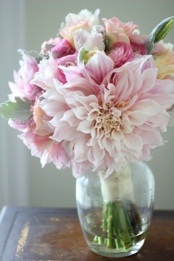

Floral colors, therefore, can take on any number of these shades to enhance or complement.
- Lilacs - There is no end of lilac flowers, ranging from the softest, lightest shades, to deeper, more vibrant hues. Any of these shades will work with this fresh palette either alone or mixed with other colors.

- Sherbet orange – One particular flower that works wonderfully with this color scheme is a rhododendron called Apricot Sherbet. The flowers are quite 24px and ruffled, and each flower consists of varying pinky-orange shades. In a room that may consist mainly of cooler blues, this shade of orange can add a much-needed dash of warming sunshine.


- Pinks – choose soft yet sweet pinks such as roses, phlox, or snapdragons. Pinks work amazingly well with this color scheme because of their simplicity. They can liven up darker hues, or enhance the soothing calm of more pastel shades.


Aquas – an alternative option for this color scheme would be to add a splash of aqua simply with flowers themselves. Although there aren’t many bright aqua colored flowers in nature, the aqua Gerber daisy is one that is vibrant enough on its own to achieve this.

Earthy tones
The third color scheme that is sure to be incredibly popular this year consists of more neutral, earthy tones. Palettes featuring deep, earthy browns, warm, mineral grays, and pale chalky hues are sharing spaces with small pops of bright hues inspired by nature.
To tie in with this color scheme, flowers can range from matching browns and grays, to more vibrant golds and rusty reds, or stand out bright oranges. When using darker flowers however, it’s always more complimentary to mix with a softly contrasting lighter choice.


- Browns and chocolates – you may be surprised to know that there are many naturally occurring dark brown flowers, most of which have ‘chocolate’ somewhere in their name. Chocolate cosmos are a deep, rich brown reminiscent of plain cocoa, while chocolate sunflowers are warmer, with petals lightening towards the tips. Similarly, button poms have a slightly orange-colored tint to them. For a splash of color, Cymbidium orchids are primarily a soft, creamy yellow, with dark chocolate centers, making them an ideal single choice.

- Golds and bronzes – Amaranthus and chrysanthemums both come are beautiful shades of gold, while Camel roses are a paler bronze.
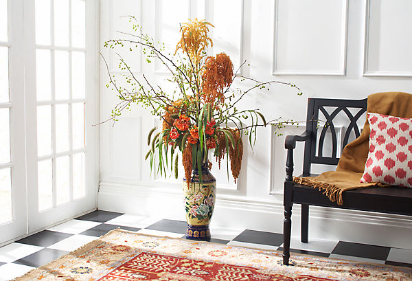
- Reds – although reds work beautifully well with this palette, they should be more rusty-colored rather than true reds. Gloriosas come in an amazing shade that will provide a pop of color to this scheme, or try a variety of Helenium known as ‘dancing flames’ for a vibrant, pretty addition.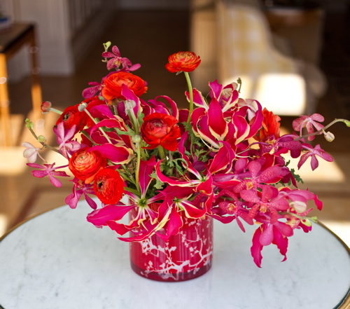

- Reds – although reds work beautifully well with this palette, they should be more rusty-colored rather than true reds. Gloriosas come in an amazing shade that will provide a pop of color to this scheme, or try a variety of Helenium known as ‘dancing flames’ for a vibrant, pretty addition.

Shading for someone else
If you are sending flowers to someone else, try to consider their color scheme. A bouquet, for example, that compliments someone’s home, is going to be placed where they can be admired and enjoyed. Because of this, it’s most definitely worthwhile knowing someone’s choice of colors before you get flowers for them.


About the Author
Patricia Hall works part-time for a florist and flower delivery but loves to surround herself with flowers at any given point of time. Even in her free time she loves to involve herself with everything flora and fauna.
'To me there is nothing more beautiful and global as the language of flowers - it is the easiest to understand all around the world in the same way. That is one reason why I truly admire flowers for what they represent in some ways - unity of all mankind!'

No comments:
Post a Comment
Thanks so much for the comment! I, seriously, love and treasure each one!